Work Orders Main Dashboard
System Overview
The Work Orders Main Dashboard presents a real-time snapshot of all work order statuses, helping supervisors balance workload, spot bottlenecks, and act quickly. It combines total counts and percentage distribution so teams can immediately understand where work is piling up and how effectively requests are being processed.
Navigation Path:Sidebar → Dashboard → Work Orders
Key Capabilities
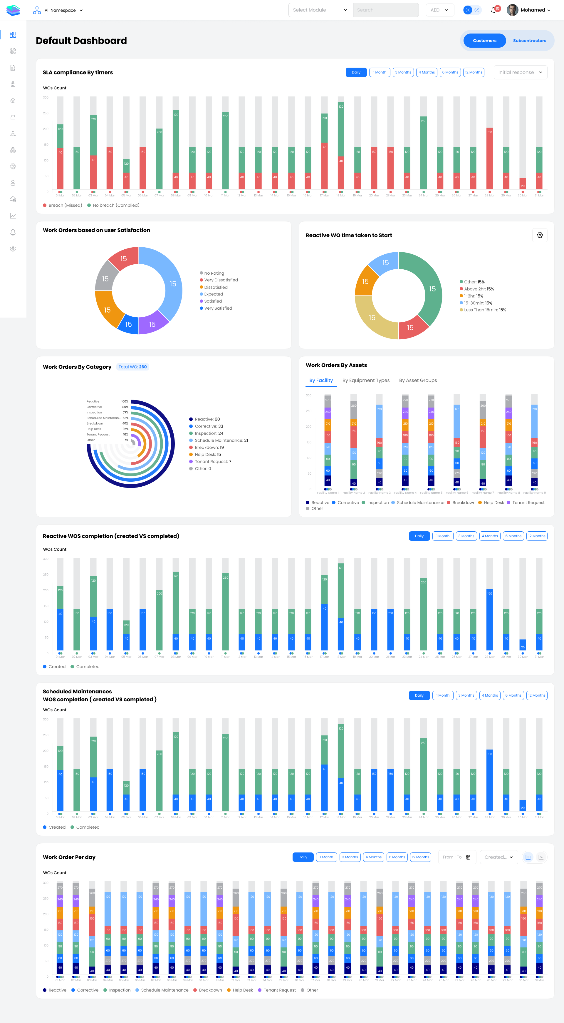
Status Tiles
The dashboard presents a status tile for every stage of the work order lifecycle. From creation to closure, the tiles show how many work orders are at each stage, making it easy to identify issues such as high unassigned volume, delays in on-site work, or repeated requests from the same source.
Additional Tiles:
- In Progress Offline Work Orders – Work orders updated while technicians were working offline
- Completed Offline Work Orders – Completed while offline, synced later
- Repeated Work Orders – Recurring issues from the same source
- Repeated Genuine – Valid repeat faults requiring attention
- Repeated Not Genuine – Non-genuine or duplicate requests
Widget Guide
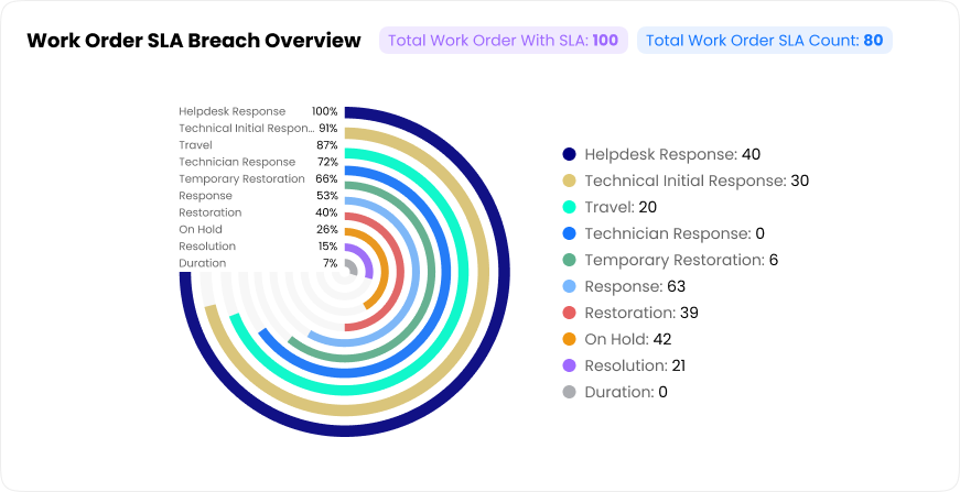
Work Order SLA Breach Overview
Highlights how and where work orders are breaching SLAs, helping teams focus on the most critical delays.
This view makes it easier to understand whether delays are mainly caused by long resolution times, slow technician responses, or late initial acknowledgements, and to prioritize process improvements accordingly.
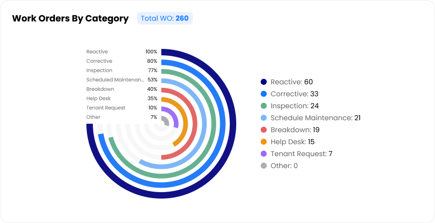
Work Orders by Category
Summarizes the total number of work orders and breaks them down by category.
A circular chart visualizes the share of each category, making it easy to see whether your operation is driven more by planned tasks or unplanned issues. This helps maintenance managers check if preventive strategies are effective and monitor the volume of reactive calls.
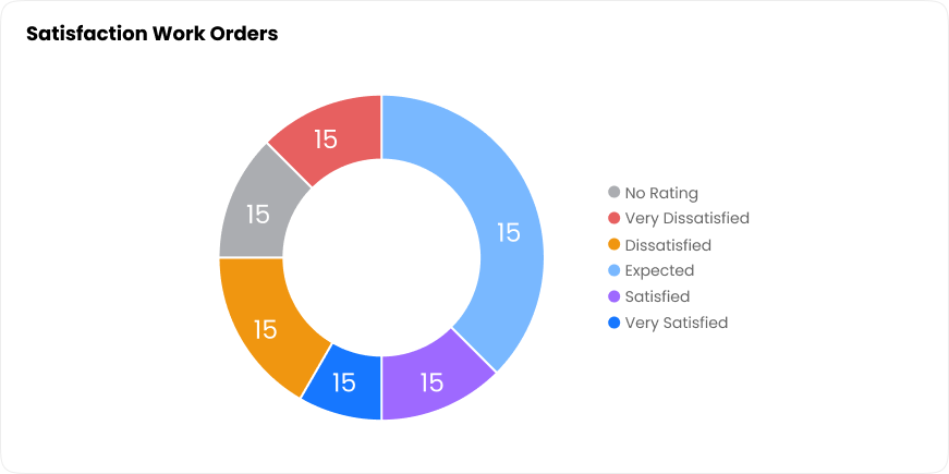
Work Orders Based on User Satisfaction
Shows the distribution of user ratings for closed work orders.
This view helps service teams track customer perception over time, identify drops in satisfaction, and measure the impact of process or SLA improvements on end-user experience.
Reactive Work Order Time Taken To Start
Groups reactive work orders by the time taken from creation to start.
This view helps maintenance managers evaluate responsiveness to urgent issues, compare performance across periods, and reinforce response-time SLAs.
Reactive Work Orders Completion (Created vs Completed)
A bar chart showing how many reactive work orders were created and how many were completed for each day in the selected period.
This view helps operations leaders understand whether reactive requests are being cleared promptly or accumulating as open backlog.
-c72d067ccb20d163d9ecf3d66f274d2a.png)
Scheduled Maintenance Work Orders Completion (Created vs Completed)
Tracks how well scheduled maintenance plans are executed by comparing planned tasks to completed work orders.
This view helps maintenance planners ensure that scheduled activities are being carried out on time, minimising missed PMs and future breakdowns.
-77cea8313a959960393164e7432a68f2.png)
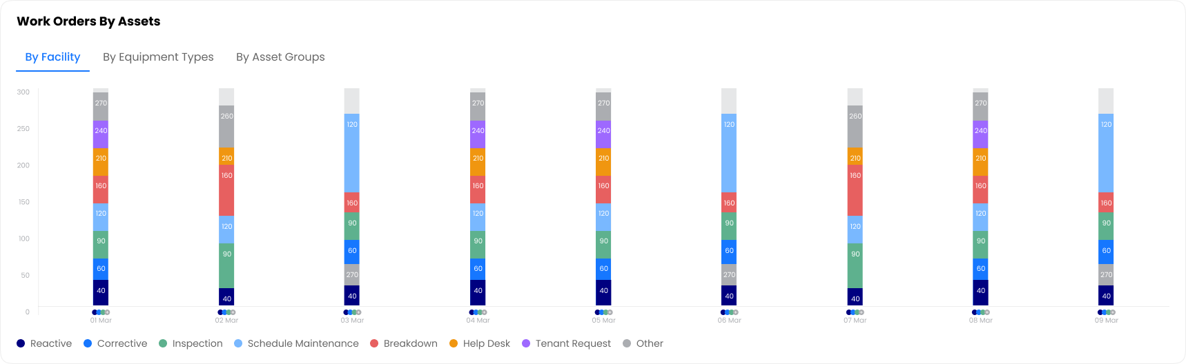
Work Orders by Assets
Breaks down work orders by different asset dimensions.
This multi-angle view helps teams prioritize resources and plan interventions where they matter most. It makes it easy to see which locations generate the highest maintenance demand and identify high-demand sites or assets that may require deeper investigation, redesign, or additional preventive maintenance.
Filters & Controls
Available Filters
- Time Range – This Month, Daily, 1 Month, 3 Months, 6 Months, 12 Months
- Facility – Filter by specific facilities or locations
- Contract – Focus on specific contracts
- Service Group – Filter by service categories
- Priority – Filter by work order priority levels
Actions
- Full Screen – Expand any chart for detailed viewing
- Export – Download data as CSV or PDF
- Drill Down – Click on chart elements to view underlying work orders
- Refresh – Update data to latest values
Key Notes
Status Monitoring
Regularly check status tiles to identify unassigned or stalled work orders. High counts in "Pending" or "On Hold" may indicate resource constraints or process bottlenecks.
SLA Focus
Use the SLA Breach Overview to prioritize which breach types to address first. Focus on the largest segments in the donut chart for maximum impact.
Backlog Prevention
Monitor the Created vs Completed charts daily. If created consistently exceeds completed, take action before backlog becomes unmanageable.
Asset-Based Analysis
Use the Work Orders by Assets view to identify problematic facilities or equipment types that may need root cause analysis or additional preventive maintenance.
Satisfaction Trends
Track user satisfaction over time. Drops in satisfaction often precede complaints and may indicate service quality issues that need immediate attention.